Here we go again: Canucks play the franchise's 50th home-opener Wednesday

Credit to Author: Gordon McIntyre| Date: Wed, 09 Oct 2019 00:13:22 +0000
The pre-game ceremony before the original Vancouver Canucks home-opener, on Oct. 9, 1970, seemed to go on forever, that’s what Jim Robson remembers.
“It was so drawn out,” the Hockey Hall-of-Fame former broadcaster said.
The Vancouver Police Band pipers performed, each Canuck player and governors from the other 13 teams in the NHL were introduced on the ice, there was a ceremonial faceoff between Vancouver’s mayor, Tom Campbell, and an MP from Ottawa.
“Mayor Campbell was eccentric,” Robson said, “and he didn’t know how to hold a hockey stick. When the puck was dropped he smashed at it backhanded, then raised his stick in the air and celebrated like he’d won the draw.”
The score was an unremarkable 3-1 win for the visiting Los Angeles Kings, who are also the visitors for this season’s home-opener Oct. 9.
“Finally the game got underway, but it was a dull game,” Robson said.
It was long before the Pacific Coliseum was allowed to sell beer under the stands, but fans could smoke in their seats.
“There wasn’t a beer in sight,” Robson noted, “but lots of smoke in the air.”
Orland Kurtenbach was the team’s first captain and will take part in the pre-game ceremony Wednesday when the Canucks announce Bo … , er, reveal who their new captain will be.
“It doesn’t seem possible that it was 50 years ago,” Kurtenbach, said. “I remember Cyclone Taylor skated to the centre-ice area.”
The Stanley Cup was in attendance in 1970, sporting Taylor’s name along with the rest of the 1915 Cup-champion Vancouver Millionaires.
Perhaps because of the franchise’s 49-year-and-counting drought at winning that Cup, the team has changed the colour schemes and logos of its uniforms more than Lady Gaga changes costumes. Toss in sundry third jerseys and you’ve got the raw materials for Joseph and the Amazing Technicolor Dreamcoat.
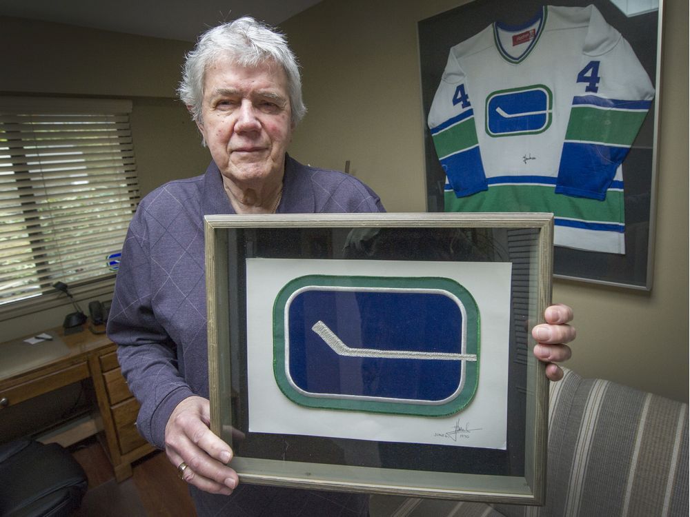
“I was at the first game, in the press box as a guest of the owners,” Joe Borovich, an East Van kid who designed the original jerseys, said from his West Vancouver home. “Yes, I was very proud.”
He won an international competition, beating out big marketing firms from the East. His design was clean, crisp, simple; the colours — blue, green and white — represented the ocean, forests and snow-capped mountains.
“I was freelancing then and when I showed people my portfolio they said, ‘You did that?’ ” Borovich, 80, said.
Over its history the team has worn the garish yellow-and-orange of the “Flying V,” which its creators in San Francisco who were paid $100,000 in 1978 said would create “happy, upbeat, aggressive players.”
Players have worn the “Spaghetti Skate” and, inexplicably, an orca appeared on Canucks’ chests in 1997, the new American owner at the time apparently unaware that a Canuck, while a mammal, wasn’t a seagoing one.
By 2007, the uniforms were blue-and-green again, maintaining the Orca but bringing back the classic stick-and-rink logo as a shoulder patch.
“They’ve twisted the hockey stick a bit, made it at an angle and changed the colours a bit,” Borovich said. “Things only I’d notice.”