Home reno inspired by Frank Lloyd Wright’s Fallingwater

Credit to Author: Mary Beth Roberts| Date: Sat, 12 Oct 2019 13:32:31 +0000
Inspired by one of the icons of mid-century modern architecture and the magnificent views across Burrard Inlet to the North Shore Mountains, Elton Donald has transformed a 1940s bungalow into an award-winning home with a new open-concept floor plan and updated finishes.
Although the North Burnaby bungalow was run-down when he bought it in 2011, Donald, a partner in Kerr Construction and Design, says the flat-roof design was forward-looking for its era and it had good bones and a solid structure.
Before: The original home was run-down, but it had good bones.
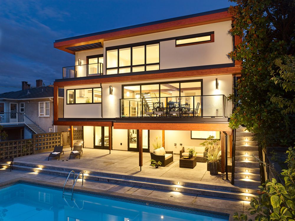
The renovated home’s distinctive mid-century modern look is inspired by Frank Lloyd Wright’s Fallingwater in Pennsylvania (designed for the Kaufmann family of department store fame).
“If I could have my dream house—and get the permits to build it—it would be Fallingwater,” says Donald. “Working with home designer Leo Chester, we were inspired by its lines and style, and from there we went our own way.”
The exterior of the home—which won an Ovation Award for Best Reno Under $1 million—underwent a significant renovation. The dated red bricks were removed as was a round window. A new vertical stone element adds interest and custom-designed glulam (glued laminated timber) beams accentuate the horizontal lines of the structure.
After: Glulam beams define the original horizontal lines of the house to give it a distinctive mid-century modern look.
To maximize the views and take advantage of the height and siting of the bungalow on the property, Donald squared off the back of the house and added 800 square feet to the original 2,900-square-foot home. “I didn’t really need the extra space, but I wanted a more open layout on the main floor,” he says. The addition resulted in major improvements to the floor plan by enhancing the flow on the main floor and creating enough space to add an ensuite bathroom and walk-in closet to the master bedroom on the top floor.
But achieving that seamless flow was a challenge even for an experienced construction professional. A major structural load path coming in and around the kitchen required significant supports and the massive beams designed to carry the load were so large that Donald believed they would be out of proportion in the space. With the structural engineer on site they found a solution—transferring the load to a post to reduce the size of the beam.
“After that change everything worked out and the beams ended up looking awesome,” he says.
One of the biggest changes was moving the kitchen. “I wanted to be able to stand at the kitchen sink and take in the view. The layout stemmed from placing the sink in an optimal position and then designing the work triangle around that placement,” says Donald.
Appliances and the sink were placed on the perimeter of the kitchen to enable the island to serve as a gathering place for family and friends.
He also wanted an island large enough to accommodate four chairs. The result is a four-by-10-foot island with deep drawers to store pots and pans and the unexpected bonus of open shelving at the ends to display kitchen-related décor.
A marble-look Caesarstone quartz (Alpine Mist) on the countertops enhances the light and bright space with its dual-tone cabinets. The lower cabinets are finished with a wood veneer, while the upper cabinets and the pantry cupboard feature white slab doors.
The spectacular light fixture’s circular shape adds another dimension to the otherwise square lines at the top of the staircase.
Choosing the right colour for the engineered hardwood floor that runs throughout the whole home (except for the basement level and bathrooms) was a difficult decision.
“We went back and forth on the floor and the finish of the kitchen cabinets. We didn’t want them to look too similar, but we didn’t want them to fight each other either,” he says.
The decision to use suede maple, with an underlying white tone similar to the white oak veneer on the cabinets, was perhaps made a little easier when Donald found a deal on the flooring. “We were lucky enough to get a large quantity of closing-out stock when a dealer stopped carrying that line,” he says.
One of the standout features in the home is the floating staircase with glass railing. While Donald liked the idea of the staircase acting as a natural divide in the space, he also wanted to be able to look through it and see the view. The stairs were bolted onto a steel H-beam embedded into the wall and the final welds to secure the structure took place in situ.
While the interior beams are structural, they were also designed to enhance the ambience of the home.
In the ensuite bathroom, Donald achieved a seamless marble look on the floor and walls by using very small non-standard grout lines and carefully arranging the oversized 36-by-48-inch porcelain tiles to showcase their pattern and veining. The countertop extends down the sides of the counter to create a unique feature in the spa-like space.
But one of Donald’s favourite aspects of the renovation is the backyard and the indoor-outdoor flow between the pool deck and interior living space. “In summer you can open up almost 20 feet of glass sliding panels and feel a cool breeze,” he says.
A small addition to square off the back of the house created the space for the master ensuite and a generous walk-in closet.